UI breakpoints
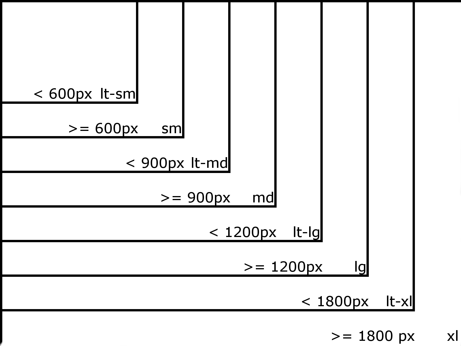
This image shows breakpoints (in pixels) which shows when does CSS takes affect. Example:
- Using col- class without breakpoint will set column width for all resolutions
- Using col-md- will set column width only starting from MD and higher resolutions, everything below that breakpoint will be full-width
- Placing some CSS in particular breakpoints Import file, will make it active only once screen width meets requirements
- -lt breakpoints are used to set style for all resolutions (widths) below breakpoint value (think as, MD - 1px)

| Usage | Breakpoint name | Screen width Style is applied |
| Mobile | lt-lg | up to 599px (including) |
| Tablet portrait | sm | starting from 600px |
| Tablet portrait | lt-md | up to 899px (including) |
| Tablet landscape | md | starting from 900px |
| Tablet landscape | lt-lg | up to 1199px (including) |
| Desktop | lg | starting from 1200px |
| Desktop | lt-xl | up to 1799px (including) |
| Large desktop | xl | starting from 1800px |